Photo by Camille Williams / North by Northwestern
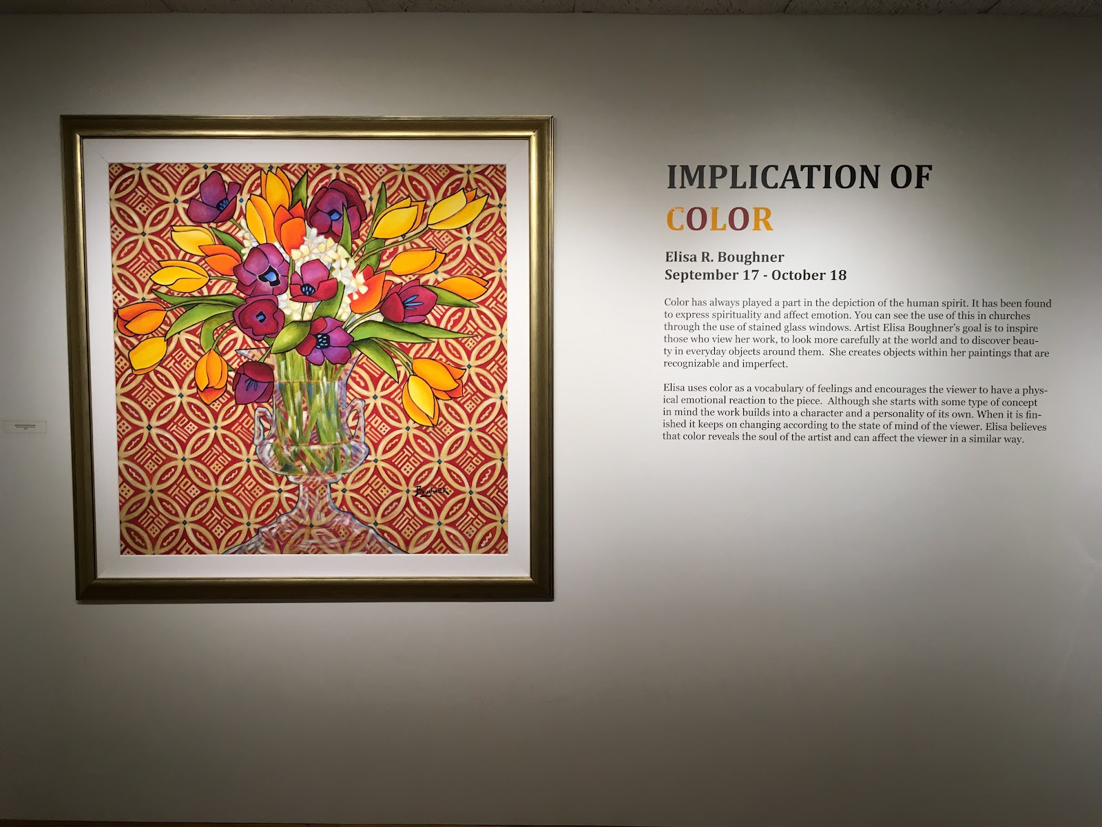
Through the chaos and stress of midterms, at times we need a break from everyday life. At the Dittmar Memorial Gallery in Norris this Fall Quarter, visitors enjoyed a worthy break by glimpsing into an artist's soul at Elisa R. Boughner's "Implication of Color" exhibit.
Boughner’s “Implication of Color,” which ran from Sept. 17 to Oct. 18, features 16 oil paintings on wood and four sculptures created from 2000 to 2018. In her artistic statement, Boughner explains her goal to explore color’s capacity to depict the human spirit and elicit an emotional response from the viewer, the way stained glass windows inspire spirituality.
Each painting is a still life featuring some combination of flower vases, patterned tablecloths, fruit and furniture. She paints them to encourage viewers “to look more carefully at the world around them and to discover beauty in everyday objects around them,” as she described in her art and poetry book for the collection. She trades realistic portrayals of color, space and perspective for cubist and expressionistic reimaginations of the mundane.
The result is a memorable, thought-provoking collection. Her works may not have been some innovative manipulation of technology or empowering political subtext, but Boughner’s refreshing return to basic art elements prompted viewers to reflect on how something as familiar as color has the power to convey what we want to say to the world and what the world is saying to us.
Though the exhibit centers around color, Boughner plays with other art elements and intentionally depicts imperfections. Brushstrokes are rather visible and colors often don’t blend smoothly. Thick, black outlines around flowers make their vibrance seem cartoonish. The outlines help contain cascading, sometimes chaotic, floral-patterned backgrounds from infringing on the foreground.
You don’t have to look hard to see a warmer shade painted under a complementary cool green or blue background. Empty space appears obvious in tablecloths, dotted by overlapping marks in a particular color, made from lightly pressing a medium-sized paint brush.

"Another Flower." Photo by Camille Williams / North by Northwestern
The names help illuminate a state of mind or story in the works, but Boughner’s poetry encourages additional reflection. In “Another Flower,” a bright yellow flower in a pink vase beams in front of a smaller flower shrouded in moody green and deep purple. Her poem portrays the loneliness, self-doubt and hesitation of the second flower, living in the shadow of attention’s sweet center. In my interpretation, the yellow flowers clearly don’t have it all together either, considering the way some buds droop and turn back shyly.

“Surrounding Beauty.” Photo by Camille Williams / North by Northwestern
"Surrounding Beauty" takes a step inside Van Gogh’s room on a “Starry Night.” Boughner gives the swirling sky and rolling hills an artificial, neon tint and depicts a pleasant interior with a leaf-patterned pitcher and vase of bright flowers. In the accompanying poem, Boughner beckons viewers to transform their outlook in life and look for the beauty in the world. It’s certainly optimistic, but the saturated colors make me feel like all the buoyancy is an illusion.
Many of Boughner’s works harken to Henri Matisse and the Fauvist movement of the early twentieth century, in which color takes precedence over other art elements. Vibrant, unexpected application of color sometimes overwhelms the subject of the work, distorting depth.

“Blue Kitchen.” Photo by Camille Williams / North by Northwestern

Henri Matisse. “Red Room” (1908). Gandalf’s Gallery / Flickr.
Specifically, “Blue Kitchen” uses a similar composition and monochromatic theme as Matisse’s “Red Room.” Boughner plays with lines and details, choosing to make the chair more realistic than a flower vase and pitcher. Differentiated blue patterns create a more dynamic composition than Matisse. Blue, the coolest color, recedes and draws the viewer into a flattened, patterned background.

“Perception.” Photo by Camille Williams / North by Northwestern
“Perception” calls on the viewers to observe their own distorted perceptions by subverting the realistic artistic perspective. We look at a table from a partially aerial point of view. The table is a trapezoidal prism, and the oranges or mangos and vase might fall off the table at any moment. A deep-blue and purple pattern flows like a leaf against a fiery tablecloth, which then blends into a chartreuse and yellow paisley-like background. I feel as if I could get lost in such a complex interplay between dissonant, bright and calm tones.
During the one hour I spent in this exhibit, I never felt sad, happy or mad, but I tried to discern something from every work. I found some color combinations warm and welcoming and others off-putting and artificial. A few tablecloths transported me to feasts celebrating the fall harvest, another to a school or a farm. Some interior settings seemed dull, or exotic and sophisticated, or so chaotic that I couldn’t possibly concentrate if I were there. Two gray backgrounds reminded me of dismal, rainy days, while two others echoed the scene of a jungle. Some color combinations were so perplexing that I couldn’t associate the work with anything, so I admired the uniqueness instead.
Boughner does not limit her color usage to bring about one emotional reaction. Rather, by interweaving complex color relationships in a single work, she encourages infinite reactions and interpretations. Viewers do not learn Boughner’s message from the subjects of the works, but through observations of the application of color.
Whether by reflecting on their own state of mind or the artist’s intentions, we fulfill Boughner's goal to carefully observe our environment and dare to reflect on how it affects us.