The slow and unsteady growth of our campus has led to some, er, interesting architectural decisions over the years. For every building you're likely to hear tour guides gushing about (Deering Library, University Hall), there's just as many you'll be led quietly by with the less said, the better.
Of course, as students we gradually grow to love (or at least tolerate) many of our university's more poorly thought out architectural plans. In the process, the buildings take on new meaning and form, sometimes far removed from the architect's original intent. In other cases, the architect's original design consciously aims to capture some aspect of the purpose it's serving, to varying degrees of conceptual and aesthetic success.
Below, find four examples of campus buildings and their architectural dopplegangers. They may not all look good, but the architects at least deserve a "You Tried" sticker.
Music and Communication Building looks like a ship
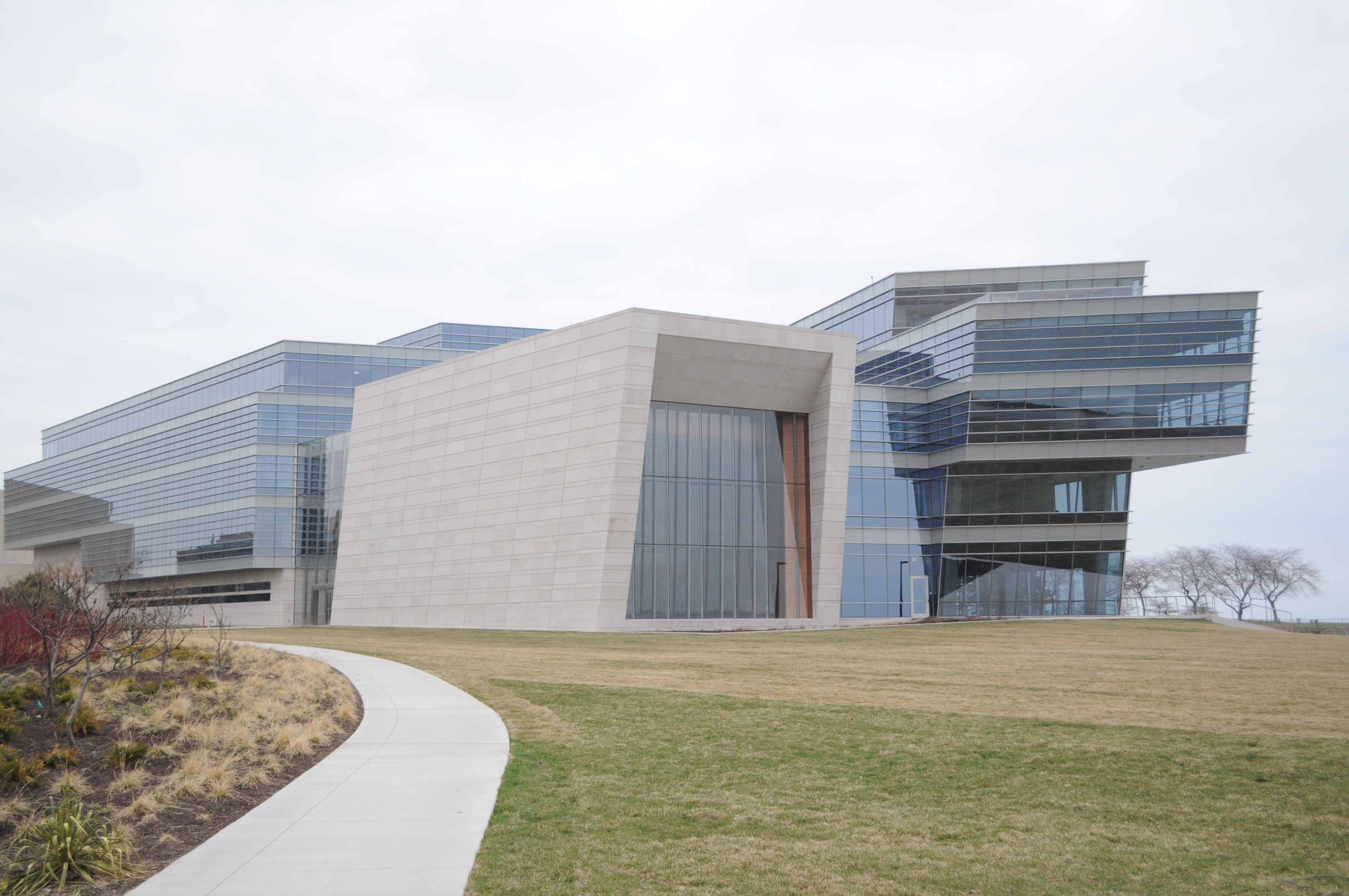
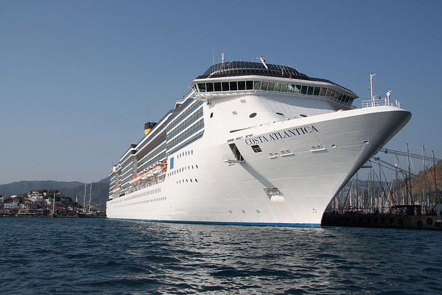
The newest addition to the university, the Music and Communication Building, just opened to students for its first quarter of classes. With a prime lakefront location, the building is meant to draw one's eye to Lake Michigan and the Chicago skyline beyond, just like a cruise ship. Fittingly, the towering mass of gleaming glass really does resemble a ship docking in the lake.
Technological Institute looks like The Pentagon
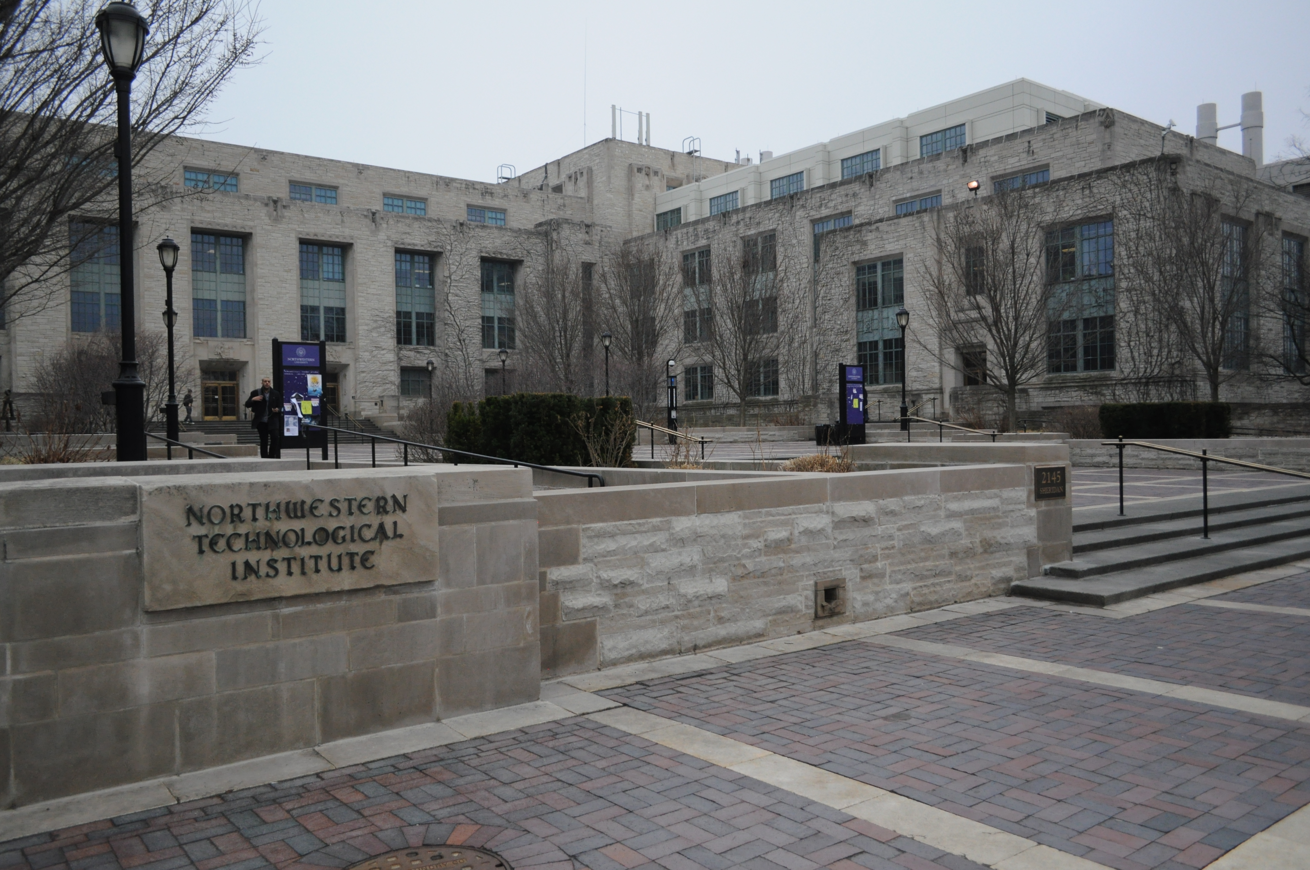

Another gem tour guides are fond of busting out – despite the fact that there are no reputable online sources out there to back the claim up – is that Tech is the world's second-largest low-rise building, behind only the Pentagon. While that claim is dubious, there's no doubt that the sheer scale of Tech does its best to rival the government building. Rigorous scientific analysis has found that you can also easily convince any South Campus kid they're in the Pentagon, purely by dropping them in one of Tech's wings and telling them to escape.
South campus parking garage looks like sails
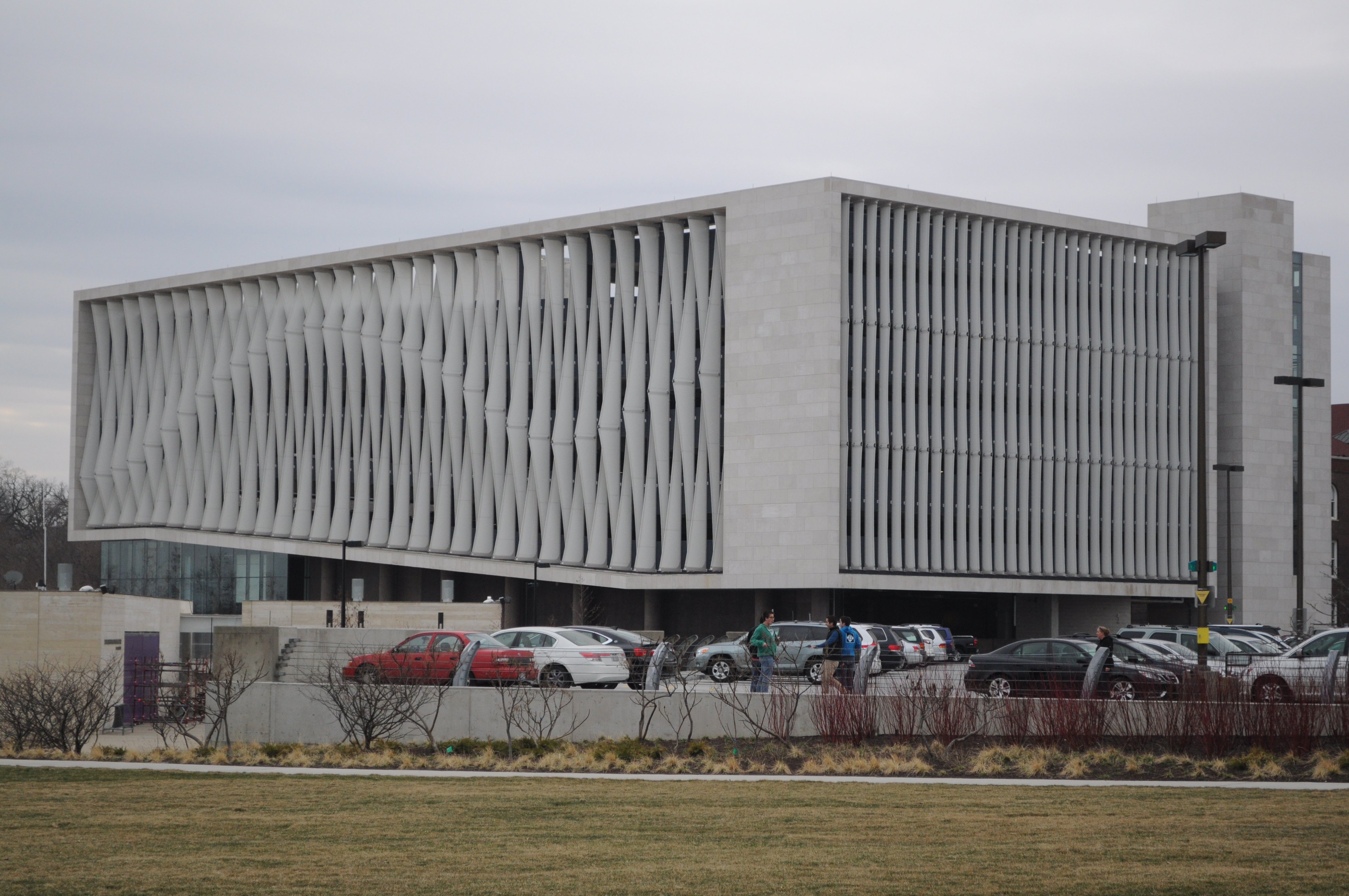
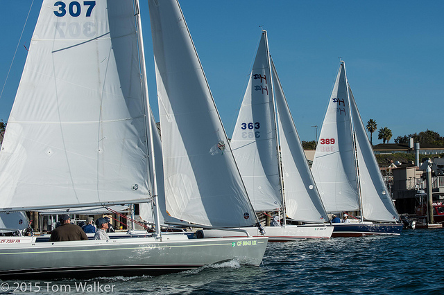
Built around the same time as the new NU Sailing Center, the combined parking garage and visitor's center opened earlier this academic year. Despite the head-scratching decision to take the last piece of prime lakefront real estate and put up a parking garage, the beach-facing exterior does an admirable job of capturing the essence of the adjacent facilities. The parking garage also does an admirable job of looking like what it's supposed to, something that can't be said of other buildings on campus. (See below.)
University Library looks like a bookshelf
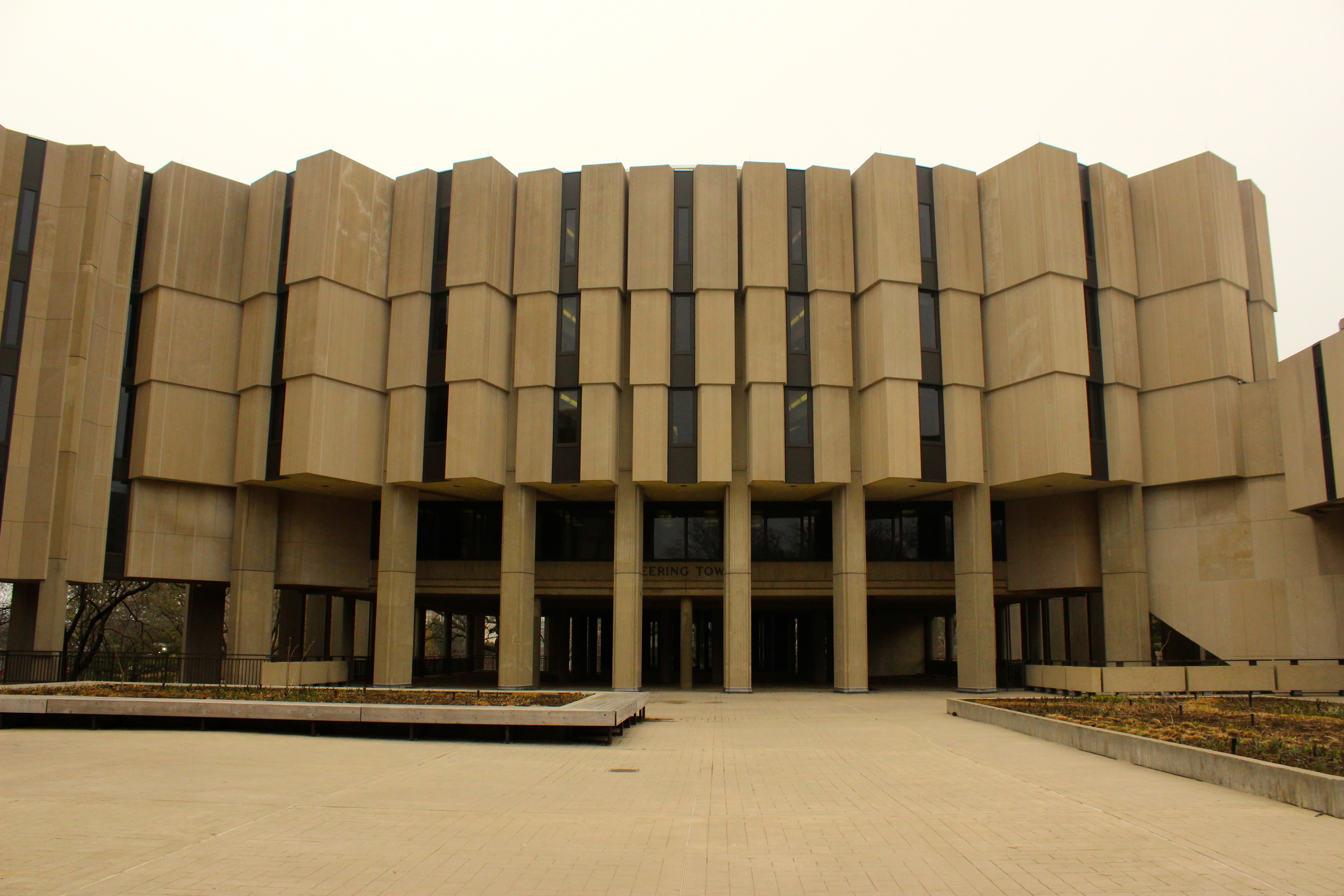

Directly across from Norris lies one of Northwestern's other biggest architectural eyesores – at least the architect behind University Library had a vision for the building. Unlike the fortress-like Norris, the Brutalist library design is meant to represent books jutting from a bookshelf. While following the classic adage "form follows function" to the upmost is an admirable goal, it's just a shame the vision wasn't better carried out.
EDITOR'S NOTE: The first paragraph and captions were updated at 2:02 PM CT on April 9.